Every Object Earns Its Place: Minimalism and the Perception of Space
Minimalist living room design for an Indian home: arrange furniture, leave space to move and use light thoughtfully while keeping the objects that give a room meaning.
By Earth & Abode StudioUpdated 9 minute read
A living room needs enough seating, clear paths, and space for the things its residents enjoy. Minimalism can help reduce crowding, but an almost empty room is not the goal. Start by asking what each piece is used for, why it matters, and whether its size and position suit the room.
01 / Purpose, not absence
A minimalist living room without erasing identity
An object can earn its place in more than one way. A chair may provide a needed seat; a textile may hold family memories or reflect a local tradition; a lamp may make evening reading easier; a carved piece may bring delight simply through colour, proportion, and craft. Functional, emotional, cultural, and aesthetic purposes all count. Start by understanding why an object matters, then give it enough room to be used or enjoyed.
This matters in Indian homes, where rooms regularly change role and accommodate several generations. Seating that appears excessive in a photograph may be entirely reasonable on a festival evening. Objects that look like clutter to someone else can hold personal memories or play a role in family and social life. Sociological work on domestic clutter describes it as bound up with identity, relationships, time, and ideas of care—not merely a failure to tidy. A useful edit must therefore begin with the resident's life, not a stylist's preferred image.
02 / Reading the room
Living-room furniture layout: paths, sightlines, and attention
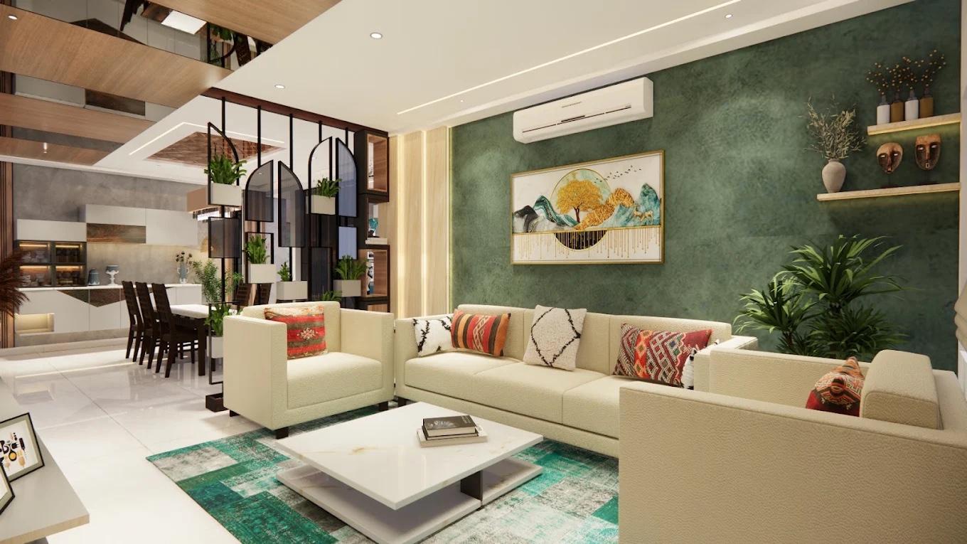
The supplied open-plan living room already has a strong identity: a deep green wall, a warm ceiling with timber and mirrors, graphic artwork, large plants, an arched screen, and a green patterned rug. The size of the furniture is one reason the room looks crowded. A long sofa, two deep box-like seats, and a broad square coffee table occupy most of the rug and make the seating area feel like one large block of upholstery.
Placement matters too. The deep seat in the foreground appears to narrow the approach to the seating area, and the left armchair leaves little room beside the dining area. The broad coffee table fills much of the space between the seats. Together, these pieces leave less visible floor and make the routes through the room harder to see.
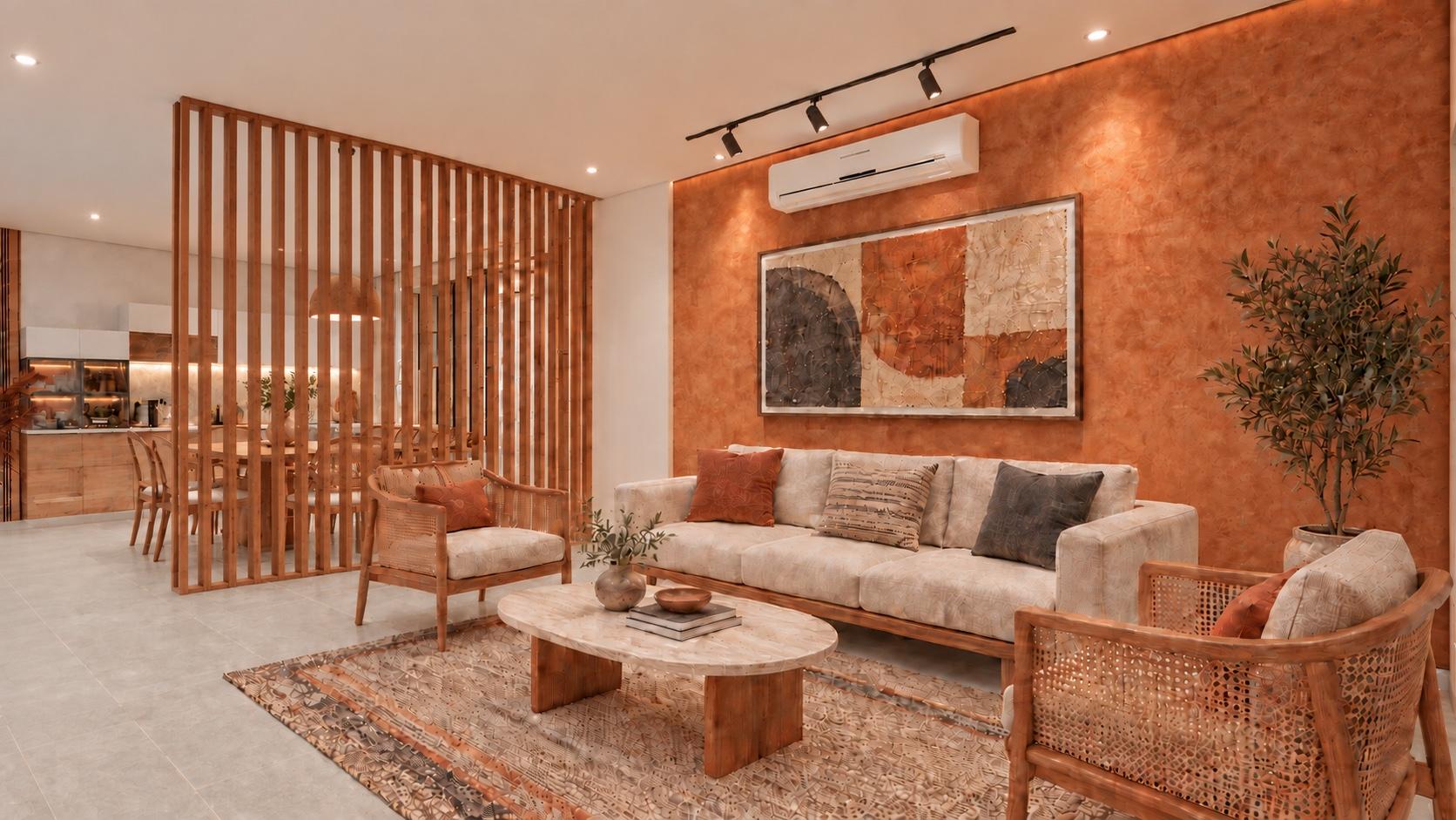
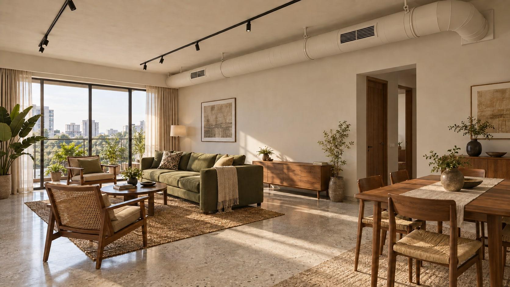
The proposed design has seating for five in the living area and six at the dining table. Raised legs and open timber frames reveal more floor beneath the furniture. The smaller coffee table and softer outlines also make the spaces between pieces easier to see.
03 / A full-room study
The same room, with more breathing space.
The proposed design is an AI-assisted visualisation, not a photograph of a completed renovation. It keeps the same viewpoint, main structure, room size, kitchen area, room uses, and direction of daylight. Wall finishes, the ceiling, lighting, divider, artwork, flooring, furniture, rug, and decorations are redesigned together to show how they affect movement, views through the room, and what draws the eye.
Documented arrangement
AI-assisted design visualisation
Documented arrangement: source image supplied by Earth & Abode for this design study.
The proposed design was AI-assisted and modified by Earth & Abode Studio. The ceiling and lighting, wall finish, artwork, divider, light Kota stone flooring, living and dining furniture, rug, decorative layer, and kitchen palette were redesigned; the camera, room volume, and principal architectural geometry were retained. The visualisation is illustrative and does not document a completed renovation.
Eight decisions, each with a job
Simplify the wall finish. Muted clay plaster replaces the dark green feature wall, giving the furniture and artwork a lighter backdrop.
Keep the ceiling simple. A plain ceiling replaces layered borders and mirrors. Downlights light the room, a slim track directs light onto the artwork, and one pendant lights the dining table.
Filter rather than block. Slender oak battens replace the arched planter divider. Gaps between the battens let light through and preserve a partial view of the dining area.
Keep the seats, show more floor. A raised sofa and two open cane-and-timber chairs retain everyday seating while exposing more floor.
Make room around the dining table. An oval table and six lightweight chairs make it easier to move around and see through to the kitchen.
Choose a focal point. One textile-inspired abstract and a ceramic vessel replace the landscape, masks, shelves, and scattered objects.
Choose durable flooring. Honed light Kota stone replaces glossy white tile with a quieter, low-sheen surface that can accept wear and be re-finished. Its sustainability case depends on verified sourcing, transport, installation, and a long service life—not the material name alone.
Define rather than fill. A handwoven rug groups the seats together, while a compact oval table leaves more of the rug visible. Similar colours in the artwork, cushions, and rug tie the furnishings together.
04 / Simplifying the whole room
When the room and its fittings compete
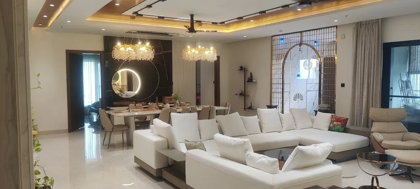
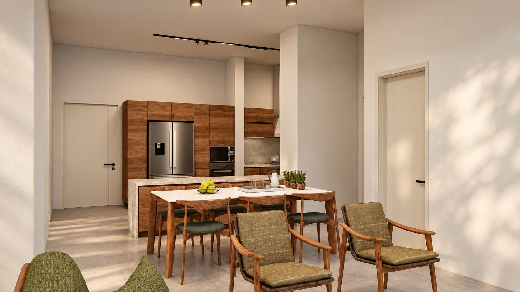
Several features make the second room feel crowded: an enclosing sectional and recliner, chandeliers beneath a layered illuminated ceiling, fluted and marble wall panels, a ring mirror, display shelves, and a decorative metal archway. The proposed design removes these competing layers while preserving the camera, room volume, openings, windows, curtains, and functional zones.
Documented arrangement
AI-assisted design visualisation
Documented arrangement and smart-control reference: Earth & Abode. Pendant reference: Sense lighting.
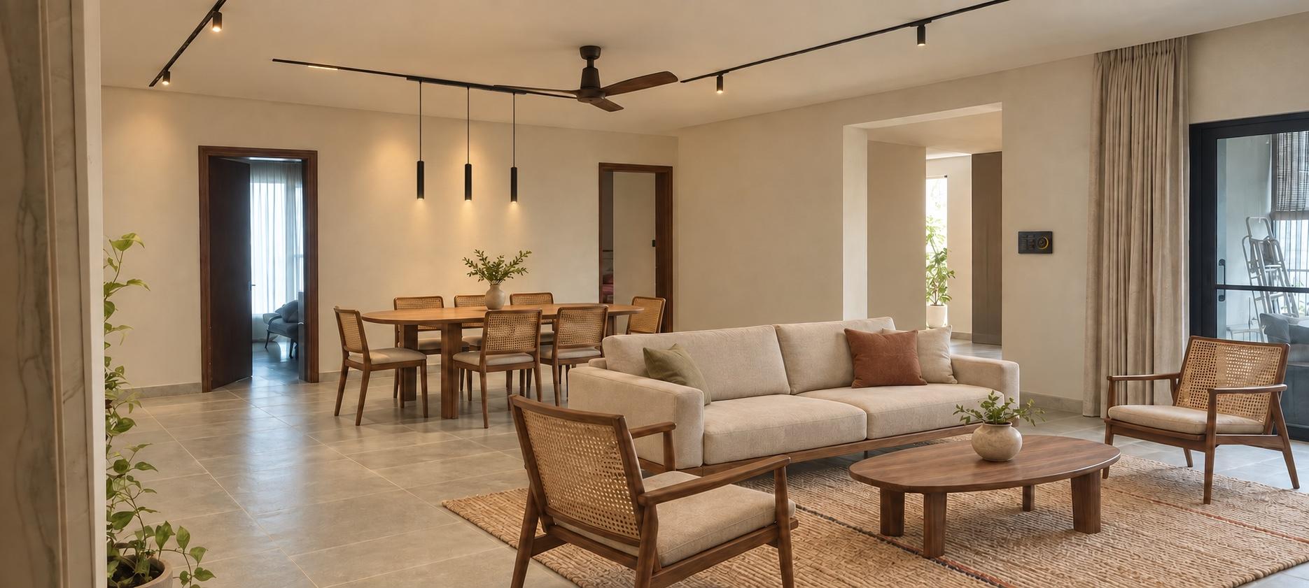
The proposed design was AI-assisted and modified by Earth & Abode Studio. Furniture, ceiling, lighting, wall finishes, archway, flooring, and control panel were redesigned. It is illustrative, not a completed renovation.
Four edits restore the room's depth
Simplify the ceiling and lighting. A single ceiling and sparse tracks—with Sense pendants—replace chandeliers, coves, scattered spots, and decorative layers.
Keep the walls simple. Warm mineral plaster and a plain rectangular opening replace fluting, marble, shelves, the ring mirror, and metal ornament.
Open the furniture plan. One raised sofa, two cane chairs, an oval table, and a lighter dining group keep enough seating and leave a clear path through the room.
Make technology quieter. The supplied smart keypad consolidates lighting, fan, curtain, and climate controls into one wall panel instead of a cluster of switches.
05 / Perceived spaciousness
Why the edited arrangement can feel larger
Perceived spaciousness is not the same as measured floor area. It depends on what we can see, how easily we imagine moving around, how surfaces are arranged, and how doors and windows connect the room to the spaces beyond. Experimental research on furnishing has found that furnishings affect how spacious a room feels, but that does not mean removing everything is the answer. Position, grouping, and the way someone moves through the room matter alongside quantity.
In the proposed design, the compact centre table and raised seating reveal more of the rug and the smooth Kota stone floor. The stone's low sheen avoids the strong reflections of glossy tile, while a visible border around the group helps the eye understand the room's boundaries. The living and dining areas feel connected, with space between the furniture groups and more floor visible in the light. Research on sequential spatial perception similarly suggests that furniture quantity interacts with lighting and window conditions: a room is read over time, through a connected series of cues, not through object count alone.
What you can see beyond the seating area also matters. Recent work examining window views and materiality reinforces that the experience of enclosure depends partly on what is available beyond the immediate interior and on the surfaces framing that view. In this proposal, the windows and openings stay in place. The gaps in the oak screen and the open chair backs make more of the dining area and kitchen visible from the living room.
“Visual clutter” has several causes. The number of objects matters, but so do colour contrast, busy outlines, uneven placement, blocked views, and groups of objects competing for attention. Changing every patterned object to a plain beige one would address colour and pattern, but it would not fix blocked paths or awkward placement. It could also remove objects that matter to the residents. A richly carved chair can sit calmly when it belongs to a coherent group; ten plain objects can feel disorderly when each interrupts a different path or sightline.
06 / A practical audit
Four questions before removing anything
Photograph the room from its usual entrance and sit in the seats you use most. Look at each object without judging it as good or bad. First understand how the room works, then decide what to change.
Purpose
Is this object useful, meaningful, part of a tradition, or simply something you enjoy looking at? Who would miss it?
Placement
Is it easy to use where it is? Does it block a walkway, a window, or access to something else?
Frequency
Is it used daily, weekly, seasonally, or only for guests? Could you store occasional items elsewhere and bring them out when needed?
Maintenance
How much effort does it take to clean, repair, move, or look after? Does that effort match the value it brings?
Mark the primary route with tape or simply walk it while carrying a tray. Consolidate items that perform the same task. Test a temporary removal for a week before donating or discarding anything meaningful. Keep meaningful objects where you can see or use them without blocking access to furniture or filling surfaces you need for other things.
07 / Limits
What this comparison does not prove
The comparison shows a design idea; it does not document the residents' requirements or measure their response. The proposed design is generated, so small material and geometric details differ despite instructions to keep the room consistent. Research on perceived spaciousness often uses photographs, simulations, or constrained experimental rooms, which cannot fully represent household routines, cultural meanings, sensory conditions, or change over time.
Nor does this article claim that a minimal interior cures stress or improves health. Those outcomes are shaped by many personal and environmental factors. The defensible conclusion is narrower: the number and arrangement of objects can change how we notice space, paths, light, windows, and focal points. Whether the result supports a particular household can only be learned by observing how that household lives.
Choose durable furniture, repairable cabinetry and movable storage. A closer look at furnishing an Indian home with less construction and fewer replacements.